View Our work
Check out what we're up to. These are some of our latest designs placed here for you to admire and get inspired.

Wallin Insurance
Wallin Insurance is an insurance agency in Elmira, NY that provides personal and commercial coverage throughout New York. Wallin has a strong community focus and we wanted to bring that aspect out in the design. Opting to use illustrations instead of photos we developed the community feel throughout the page.
The copywriting was created to speak to a customer that was looking for an alternative to big name insurance agencies. Large agencies talk about the "average" customer that always seems to get a better deal then you do when you call. We aimed to highlight the value found in working with your local agency that understands your business and may well be a neighbor.
View Wallin Insurance Design

The Winner's Circle
The Winner's Circle is an ice cream shop serving up frozen treats just minutes from the Watkins Glen International Raceway (hence the clever name). We really set out to set Winner's Circle apart from their competition by avoiding the common colors and page layout used by their competition. Using the business's main brand color we put together a palette that is strikingly different from the competition.
With the fun and different design our next focus was to simplify the menu. The near 1000 items available leave customers overwhelmed and can lead to confusion. The design highlights a dynamic menu that reduces the amount of choices for customers to browse making it much easier to know what to expect when they show up.
The copywriting is fun, inviting, and focuses on the experience rather than the accolades of the business. The target customer in mind is families and so we spoke to the convenience of an outing to The Winner's Circle. The calls to action focus on customer generation and reputation growth with an offer for a free ice cream and a request to add a review.
View Winners Circle Design
X31 Technologies
X31 Technologies develops custom apps and SaaS (Software as a Service) for Christian ministries in the USA. Their main focus is creating online training platforms where clients can give access to members to watch videos, read materials, and access other resources they develop.
The design uses a dark theme which really stood out in comparison to their competition that all use bright colors. Photos were cut up to make the mosaic style images adding a layer of complexity without detracting from the information. Clear calls to action stand out against the dark theme without overpowering it.
With church pastors in mind the copywriting focuses around the value of having an online platform in which to deliver resources. Features were highlighted by their benefits first and the list broken up into easy to consume pieces.
View X31 DesignDesirae's Creations
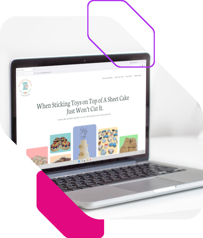
Desirae's Creations is a custom bake shop in Horseheads, NY they make everyday bakery treats as well as custom cakes. We wanted to put together a fun and bright design that would highlight the different services they provide without feeling disconnected. The large margins and spacing help the pastel colors used on the images really stand out while showing off lots of the bakery's creations in a collage format.
The target audience we were speaking to was based on individuals looking to purchase a cake for a special occasion, but wanted something more upscale then the local supermarket would provide. A method to browse what options are available as well as order a custom cake online provided ways to address website visitors ready to buy and those that are just checking things out.
View Desirae's Creations Design
Are You Ready To See What We Can Do For Your Business?
Get Instant Quote
